EVOLVE Kickboxing
Redesigning a women-only boxing gym's landing page to reduce anticipatory anxiety and convert interest into action, without losing the gym's credibility and edge.
100% expressed interest in trying boxing · only 25% followed through
Scroll for the story or jump to the solutionThe Problem
She's already decided to try boxing.
She opens the tab. She closes the tab.
Women interested in boxing often drop off before attending their first class, not because of low interest, but because of intimidation, uncertainty, and the fear of not belonging. The gym's existing landing page unintentionally reinforced these barriers by failing to communicate who the space was for, what to expect, and how to take the first step.
Design Challenge
How might the landing page lower intimidation while giving first-time visitors the clarity they need to take the first step?
Research
Intimidation was showing up before the first punch was thrown
I focused the research on emotional barriers and decision-making because the core problem was psychology, not navigation. Women weren't failing to find the gym; they were talking themselves out of going before they ever got there.
Secondary Research
Gender dynamics · combat sport barriers
Established the academic and cultural context: why women disproportionately experience intimidation in combat sport settings even when explicitly welcomed.
Informal Interviews
Women interested in fitness and boxing
Surfaced the emotional texture of hesitation: specific fears, mental scripts, and what signals would have reduced or amplified the barrier.
Competitive Analysis
Traditional gyms · women-led fitness studios
Mapped how visual tone, messaging, and information hierarchy communicate safety or intensity before a word is read.
Homepage Audit
Content · tone · emotional sequencing
Analysed how the current landing page structures its first impression: what it prioritizes, what it buries, and what it never surfaces at all.
Key Findings
The drop-off didn't happen at the gym.
It happened at the decision.
Research confirmed that the barrier to attendance was emotional, not logistical. Women weren't failing to find the gym; they were talking themselves out of going.
100%expressed interest across 8 informal interviews with women who had considered trying boxing, yet only 25% followed through with attending a first class
90%of participants couldn't immediately identify that the gym was women-only in a quick landing page scan task conducted during interviews
↓ buried buried below four conversion sections, visible only after significant scroll — at the exact point most first-time visitors had already disengaged
↑ intensity Darker aesthetics increased perceived intensity. Lighter visuals were directly associated with approachability and lower anxiety
Before
The existing landing page: where it focused its energy, and where it didn't
Before exploring new directions, I reviewed the gym's existing landing page to understand the first-time user experience. The structure was conversion-focused and covered a lot of ground. What I was looking at was the emotional sequence: what signals came first, and in what order belonging, safety, and action were introduced.
Performance-first impression
The hero establishes energy and legitimacy immediately, but provides limited emotional context for visitors still evaluating whether they belong.
Skill-level framing
Services organized by level reinforce professionalism but subtly foreground performance over reassurance at the exact moment a first-timer needs it most.
Women-only, buried mid-scroll
The gym's most reassuring signal, that it's a women-only space, wasn't visible above the fold or in the first scan. For a visitor on the fence, that clarity needed to come first.
Strong conversion intent
Repeated CTAs reduce access friction, but action is emphasized before emotional hesitation is fully addressed, inverting the psychological sequence users need.
The page had strong bones. What it didn't have was an emotional sequence that matched how a first-timer actually makes a decision.
Design Principles
Three principles to guide
the hero redesign
Rather than optimising the existing structure, the redesign was anchored in three principles derived directly from the research. Each shapes how the hero communicates before a single CTA is encountered.
Rather than leading with performance, intensity, or transformation, the hero prioritizes emotional safety. The goal is to help first-time visitors feel comfortable and supported before asking them to commit.
Users needed to quickly understand who the gym is for and how to get started, without scrolling or guessing. Key information must surface immediately to reduce hesitation caused by uncertainty.
The visual direction reframes strength as supportive and inclusive rather than intimidating. The goal is to maintain credibility as a serious boxing gym while lowering emotional barriers for first-time users.
Design Exploration
Wait a minute: direction A or B?
One insight stopped the exploration in its tracks: as a women-only gym, the largest structural barrier of gender safety was already removed. If safety is already established, what does the landing page actually need to do? That question reframed everything, leading to two distinct directional responses.
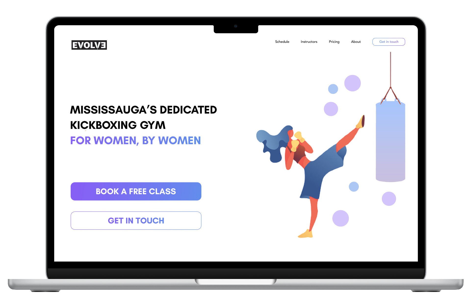
Direction A
Approachable + Comfort
- Soft contrast reduces visual intensity, creates a calmer first impression
- Left-aligned layout creates a familiar, stable reading flow
- Illustration style aligns with the colour palette and softens impact
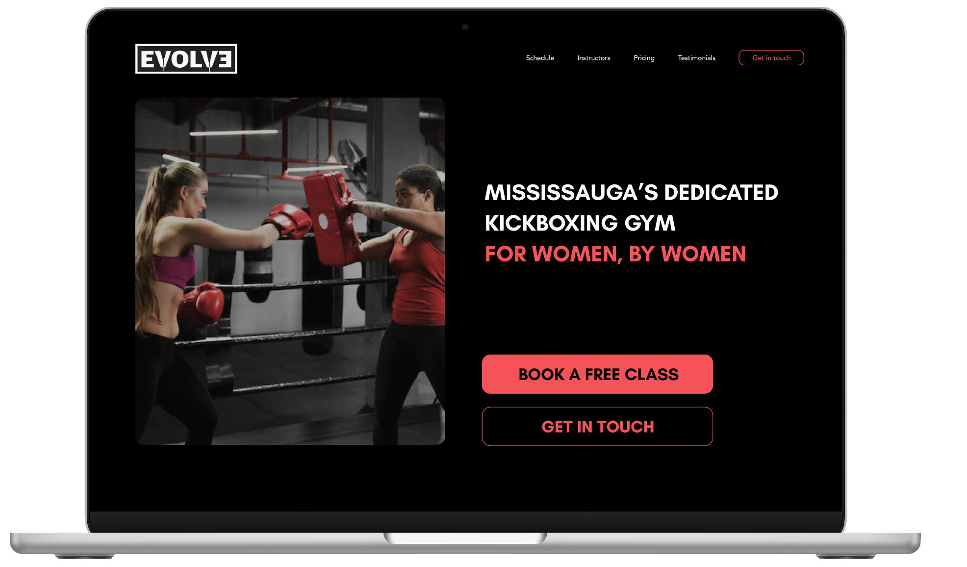
Direction B
Empowering + Confidence
- High contrast creates immediate visual impact and intensity
- Asymmetric composition creates tension and visual energy
- Real-action photography highlights movement and athletic identity
Why no single direction was selected
Both directions were visually strong and communicated different psychological entry points. Selecting one without defined business positioning would have been premature. The exploration revealed that reducing intimidation isn't always about softening intensity; it's about clarifying belonging. If the gym's goal is accessibility and first-time comfort, Direction A lowers the barrier. If the goal is brand strength and performance-driven identity, Direction B establishes a bolder presence. The right answer depends on who the gym intends to serve, and that decision needs to be anchored in the business before the design can follow.
If I had to choose today
I'd go with Direction A. The research is specific about why: darker, higher-intensity visuals tested as more anxiety-inducing, while lighter visuals tracked directly with approachability. Since the core barrier identified in research was intimidation, not awareness, a direction that reduces visual intensity addresses the actual problem rather than just the brand's confidence. Direction B is the stronger choice only if the gym's priority shifts toward performance positioning over first-time conversion.
Reflection
What this project reinforced about emotional design
This project reinforced that emotional design isn't about choosing what looks better, it's about aligning tone with who you're designing for. The same visual choice reads as energising to one person and alienating to another. Design's job isn't to please everyone, it's to make the right person feel like the space was made for them.
Once I recognised that the women-only structure removed the primary safety barrier, the design question changed entirely. It moved from "how do we make this feel safe?" to "how do we make this feel like theirs?" That's a very different brief.
The intimidation that prevents attendance rarely happens in the gym. It happens in the imagination, before the tab is even opened. A landing page that makes a first-timer feel like she belongs before she's read a single line of copy is doing real conversion work. It's just harder to track than a click.
Without defined business positioning, a final direction would have been a stylistic choice rather than a strategic one. The exploration deliberately concluded at a fork, because the next step belongs to the business, not the designer.
This project shifted how I think about intimidation in male-dominated spaces. Clarity can be more powerful than motivation. And sometimes the most important design decision is surfacing the right word above the fold.
If this moved into a real client engagement, the next step would be a stakeholder session to align on positioning before any direction was finalised. The design decision is really a business decision about who the gym is trying to reach.