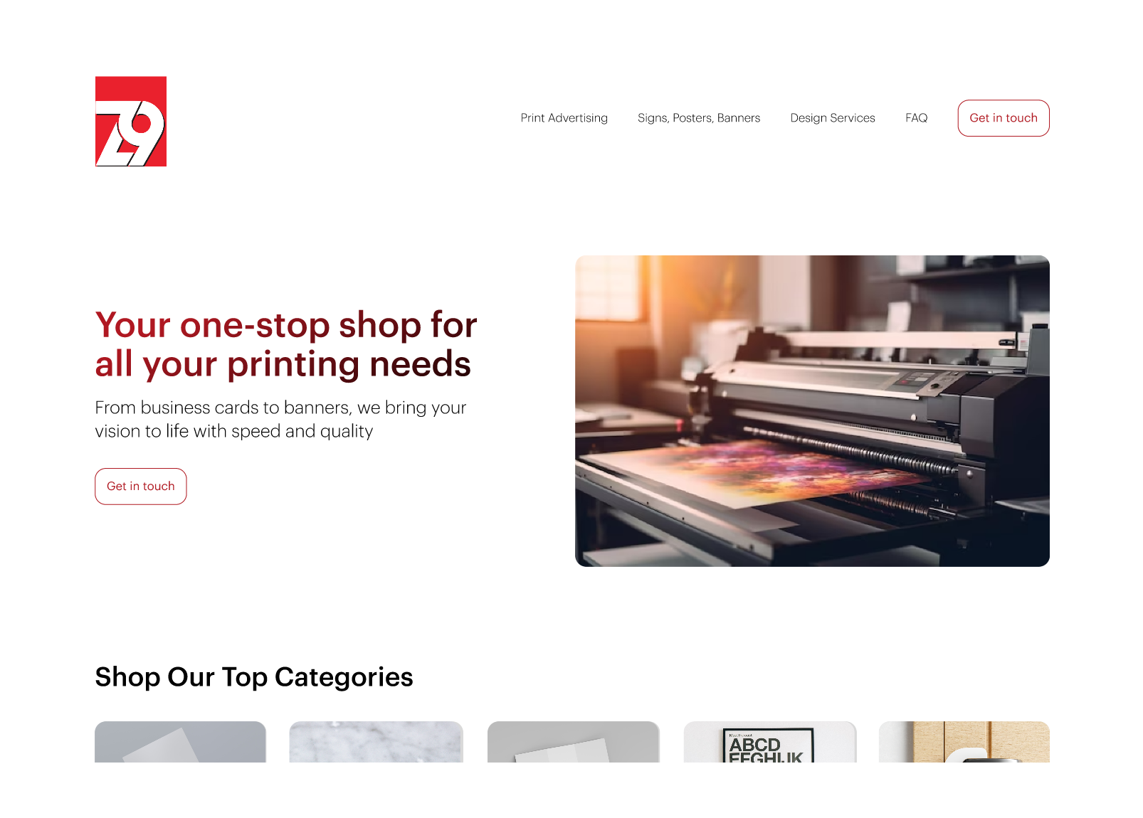
No website, no structure, 50+ products. Designing a full digital presence for a print business that ran entirely on phone calls and in-person visits.
94% task completion · −62% time on task · SUS 82
What I Delivered
50+ product pages
Designed solo from first conversation to full developer handoff, including specs, documentation, and a complete product catalogue. Implementation was carried out by the client's development team.
IA built from sales data
Used transaction history and customer interviews to build the full product structure from scratch.
2 rounds of testing
Category structure and inquiry flow iterated based on real usability sessions, not assumptions.
Zeenine Media ran entirely on phone calls and in-person visits. No way to browse products, check pricing, or submit an inquiry outside business hours.
There was a landing page. It didn't do anything. Missed calls, manual orders, specs communicated verbally.
The Goal
Turn years of scattered product knowledge into something a customer could navigate on their own. Built to grow.
The Problem
Understanding the Business and Its Customers
Every print order involves custom specs: material, finish, size, quantity, turnaround. With no digital system for any of that, customers had two options. Call and hope someone picked up, or drive in.
1
No product structure existed. No taxonomy, no naming conventions, nothing.
2
Customers couldn't self-serve on specs, so every inquiry needed direct back-and-forth
3
Phone and email orders regularly came in incomplete, leading to incorrect jobs and last-minute reprints
4
No structured intake meant rush jobs piled up with no way to manage priorities
Design Challenge
How do we take years of scattered product knowledge and turn it into something logical, intuitive, and scalable? Something that works for a customer who isn't sure what they need, and a business that has never had to explain itself in writing?
The business had never had to explain its catalogue in writing. I had to build the structure from nothing.
Research
Going to Where the Customers Were
There was no existing digital footprint to learn from. I went directly to the store, talked to customers in person, and followed up with surveys sent to the previous order list.
Method
What it surfaced
In-person interviews
At the store · existing customers
Customers weren't avoiding digital by preference. They had no digital option that felt clear or reliable enough to try.
Email surveys
Previous order list · broader reach
Incorrect and incomplete orders were common. Customers assumed they had done something wrong, when the issue was a process with no structure.
Sales data analysis
Transaction history
When the client couldn't provide structural guidance, 6 months of transaction data became the foundation for every IA decision.
Stakeholder interviews
Business owner · operational context
Key constraints surfaced: no checkout, no public pricing. The real goal was inquiry volume, not transactions. That changed how I designed everything.
9 in 10
Customers found it frustrating to place orders during business hours
80%
Would prefer to browse and order online but needed product guidance
~60%
Received at least one incorrect or incomplete order due to manual intake
Voices from the Research
Sarah34 · Small Business Owner
01
I always have to plan my day around visiting because I live and work 30+ minutes away from the store.
Marcus41 · Real Estate Agent
02
I order signs and flyers constantly for listings. Half the time my emails go unanswered and I end up driving in just to confirm details I already sent.
Leila28 · Freelancer
03
It's not just about ordering. I need to know the best product, material, and size. Without a simple online system, the specs take too long to figure out.
David52 · Restaurant Owner
04
I run a busy business and need to send flyers efficiently. I can't wait days for a callback just to place a simple order.
Strategy
Building Structure from Real Business Data
The research made the gaps clear. I had to build the product foundation from scratch using six months of sales data (receipts, invoices, and emails). The strategy came down to three things:
1
Decisions built on what customers actually did
Every structural choice came from what customers actually bought, not what anyone assumed they wanted.
2
Reduce complexity through logical grouping
50+ products with spec variation. The category structure had to match how customers thought about products, not how the business classified them internally.
3
Built for a catalogue that could expand without breaking
Consistent naming and structure across all products, built around how customers actually browse.
Business Constraints
Some decisions weren't mine to make:
No online checkoutNo public pricingInquiry-first, not transaction-first
No checkout meant every product page had to build enough trust that a customer would submit an inquiry rather than leave. That shaped everything.
Six months of sales data became the foundation for every decision.
What I Did
From Scattered Catalogue to Structured Experience
1
Audited 50+ productsUsed purchase data as the primary input, not the client's assumptions about their own catalogue.
2
Eliminated 20+ internal labelsCustomer language from interviews replaced terminology that tested poorly in round one.
3
Iterated after first test roundInitial groupings were too business-centric. Restructured around how customers described what they needed.
4
Sourced 75+ product imagesEvery image was found individually from royalty-free libraries. For the first time, customers could see exactly what they were ordering instead of trying to picture it from a description.
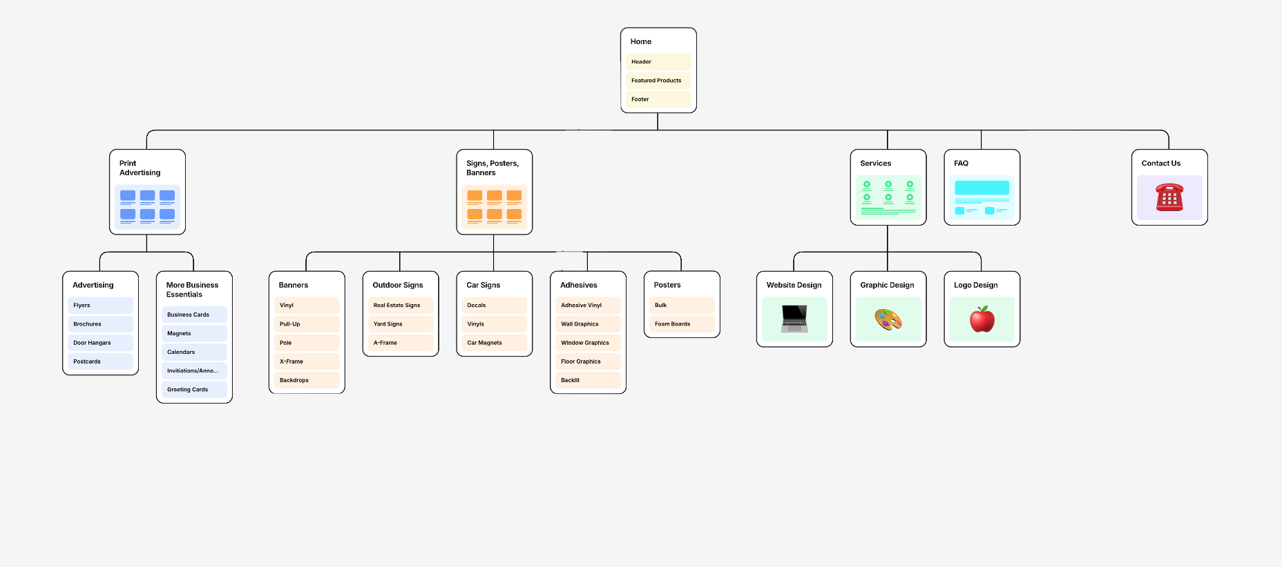
Site map
Why it matters
Information architecture · Findability
No product structure meant every order started with a phone call. Building the IA from real purchase data meant the structure reflected actual demand. When customers can find what they need without help, inquiry volume drops. For a business drowning in back-and-forth, that was the whole point.
1
Submit now, clarify laterRemoving the spec barrier reduced abandoned inquiries. Customers share what they know and the business follows up on the rest.
2
Zero mandatory spec fieldsReducing friction brought in customers who previously gave up mid-form. The only required field is how to reach them.
3
Standardised all inputsConsistent field types and naming prevented the missing information that caused recurring fulfilment errors.
4
Every form submission had enough information for the business to act on immediatelyStructured forms meant no manual chase-up before work could begin. The business could respond faster.
Form field logic
Material spec
Most customers don't know this. Asking upfront creates friction with no benefit to either side.
Preferred
Finish type
Useful if the customer knows it, but not a blocker. The business confirms in follow-up.
Optional
Product type
Helps route the inquiry, but customers often arrive via a product page anyway.
Optional
Contact details
The only thing the business needs to respond. Everything else can wait.
Required
Why it matters
Inquiry flow · Conversion
A better FAQ was never going to fix it. The real barrier was asking customers to answer questions they couldn't answer yet. The zero required spec fields came directly from watching participants abandon mid-form when they hit something they didn't know. Reframing the form as a starting point rather than a complete submission meant more people finished it. More inquiries came in, better structured, and the business could respond without chasing missing details.
1
Reconstructed the full product catalogueCross-referenced invoices, receipts, owner conversations, and online research to piece together everything the business actually offered. This became the foundation every product page was built on.
2
Standardised product languageSizes, finishes, and options were described inconsistently across sources. Established one clear format for each so every page spoke the same language.
3
Designed each page around its own constraintsProducts vary too much for a single template. Different sizes, finishes, and options needed different layouts. Consistency came from structure and language, not forcing everything into the same template.
4
Added 75+ product imagesFor the first time, customers could see exactly what they were ordering instead of trying to picture it from a description.
Sources used to reconstruct the catalogue
Invoices and receipts
Primary source. What the business actually sold.
Stakeholder meetings
Filled gaps the receipts couldn't answer.
Online research
Industry-standard specs and product categories used to validate and fill remaining gaps.
50+ products documented
The result: a complete product reference that didn't exist before.
Why it matters
Content systems · Operational accuracy
The catalogue didn't exist. Before any design work could happen, the product system had to be built from scratch using invoices, owner conversations, and industry research. Standardising the field types and naming came directly from seeing the same fulfilment errors repeat across multiple invoices. That reconstruction wasn't extra work. It was the foundation everything else sat on.
Final Designs
Two user flows recorded from the final prototype. Flow 1 follows a customer finding and specifying a product. Flow 2 shows the inquiry submission end-to-end.
Flow 1
Home page to product page
Flow 2
Inquiry form submission
Two rounds of moderated testing. Same tasks each time. Here's what changed.
Outcomes
What the Testing Showed
Two rounds of moderated usability sessions with 15 participants total. Same tasks as the research baseline each time: find a product, understand its specs, submit an inquiry.
Usability94%
Task completion. Up from 51%.
Usability−62%
Reduction in time-on-task
From user surveys~70%
of participants said they would reduce or eliminate phone and email contact if an online ordering option existed
SUS Score82
Above industry benchmark of 68
Usability metrics from two rounds of prototype testing. Phone and email volume reduction based on participant survey responses.
Reflection
What This Project Taught Me
The design problems weren't the hard part. The requirements shifted partway through. Constraints I didn't know about appeared after work had already started. That's just how real projects go. Learning to keep moving without perfect inputs was the most useful thing this project taught me.
The hardest decision
Building the IA without reliable client input. I used sales data as a proxy for user intent. Research was documented through working sessions and stakeholder conversations rather than formal deliverable artifacts, which meant staying organized took extra discipline. Real projects rarely come with clean inputs.
Where I pushed back
I pushed for checkout and transparent pricing. The business passed on both for operational reasons. Knowing when to advocate and when to adapt is something this project sharpened.
What surprised me
How much of the design work was actually content work. Building the catalogue, writing product descriptions, sourcing images. The structure I designed only worked because the content was solid first.
What I'd do differently
I'd establish a formal scope document at the start. Working directly with a business owner means priorities can shift quickly and having something written and agreed on would have kept the project on track when they did.
The decisions made from real data held up, and the testing confirmed it.