Existing platforms gave Toronto Maple Leafs fans all the data and none of the clarity. I designed a statistics experience from scratch to make that data feel immediate, readable, and rooted in how the game is actually played.
Scan time reduced from 45s to under 5s · 100% stat recognition at a glance
What I Delivered
4 screens designed
Home, Standings, Schedule, and Players. Each addressing a distinct user need identified in research.
12 participants tested
Moderated usability sessions with new, casual, and frequent fans across 30 to 45 min sessions. Research was conducted through online forums and competitive analysis.
0 prior hockey knowledge
Came in with zero sports background. That shaped every research decision and made every friction point personal.
The Toronto Maple Leafs have one of the most passionate fan bases in the NHL. Their statistics platforms have just as much data. The problem is that passion doesn't make the interface easier to use.
I came into this project with zero sports background. No assumptions about how stats should look, what numbers matter, or how fans think. That turned out to be useful. I had to learn hockey the same way a new fan would, which meant I felt every friction point firsthand. By the end I became a Leafs fan (Go Leafs Go!).
My role was to define the user problem, validate it through research, and design a clear interface that could support casual fans and statistics-heavy users without asking either group to compromise.
The goal
Give TML fans a way to quickly understand games, standings, and player performance without requiring deep stat literacy.
Supports both casual and data-driven fans
Makes statistics readable without requiring prior knowledge
Feels familiar to fans from day one, no learning curve required
The Problem
Uh oh... sports statistics can be confusing
Existing platforms make casual fans work to find what matters, while experienced fans have to work harder than necessary to get meaning out of the interface. The data is all there. The problem is everything around it.
1
Information overload
Too many metrics compete for attention at once. No clear signal about what to look at first.
2
Weak visual hierarchy
Primary and secondary information appear equally important, so nothing reads as the main thing.
3
Assumes prior knowledge
The interface expects users to already know where to look, leaving newer fans behind immediately.
Design challenge
How do I present essential Leafs information in a way that feels immediate, readable, and built for fans?
The frustration is widespread
"There's a lack of consistency"
Reddit · r/leafs
"I have used this website for years and I'm still overwhelmed"
Usability session
"The site is awful and has been for years"
Reddit · r/hockey
"The whole website is a mess"
Reddit · r/leafs
Quotes are about competitor platforms and existing stat sites.
Research Methods
Observing how fans actually interpret and scan sports data
I had no prior knowledge of hockey going in, so I could not assume what was obvious or confusing. I needed to watch real fans interact with real platforms before drawing any conclusions.
User Walkthroughs
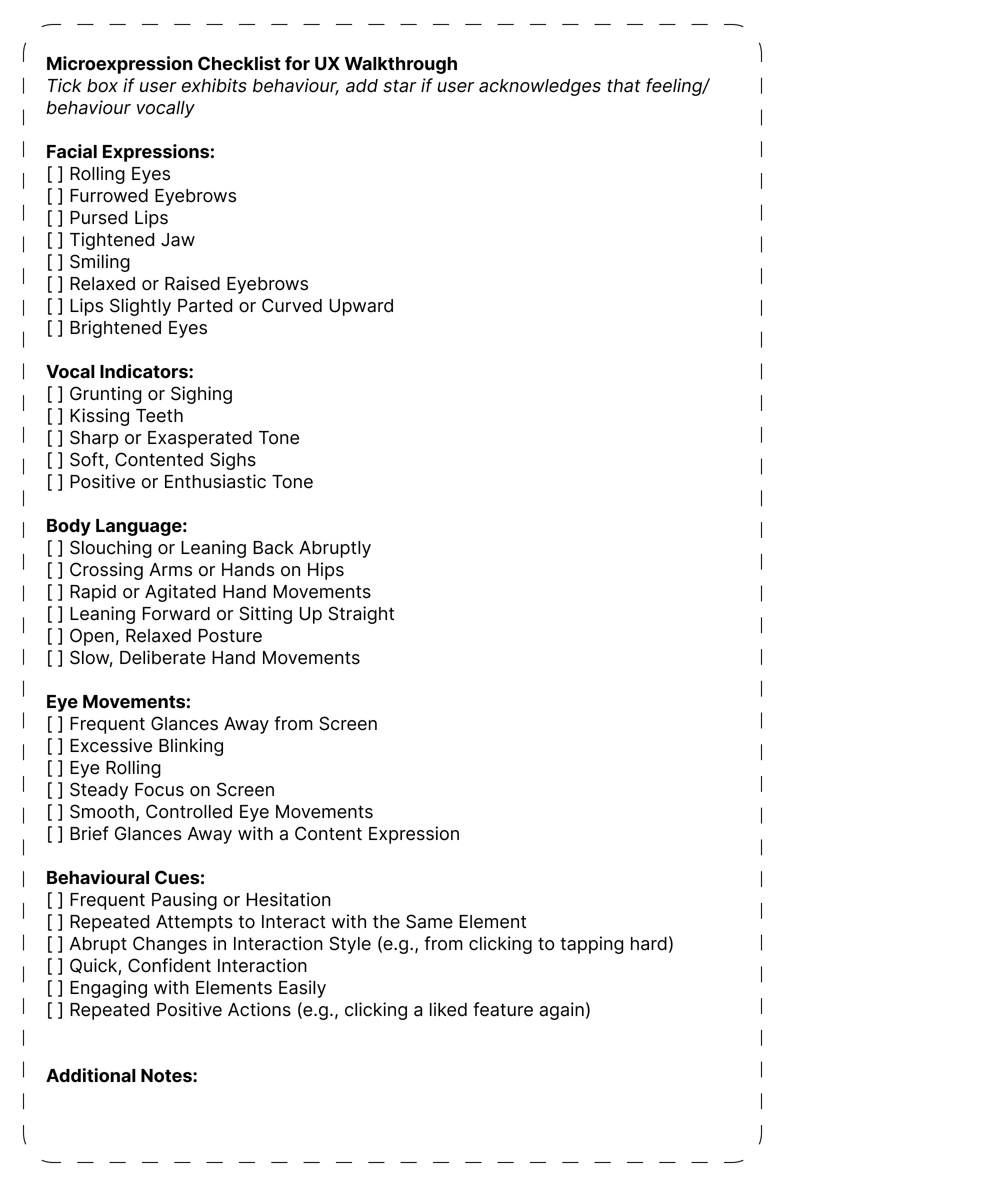
Moderated usability sessions with 12 Toronto Maple Leafs fans, observing hesitation, backtracking, and verbal reactions using a structured behavioural checklist.
12
TML fans across experience levels
3
fan types: new, casual, frequent (4 per type)
30–45 min
per session, moderated with behavioural checklist
Walkthrough Observation Framework
Walkthrough Observation Framework
Online Research
Fan forums and subreddits told a consistent story. The same complaints about density, clutter, and poor scannability kept coming up across communities that had never spoken to each other.
Reddit · r/leafs
Reddit · r/hockey
Hockey fan forums
User Archetypes
Who I was designing for
Based on walkthrough observations and online research, I grouped users into 3 fan archetypes. Each had a distinct goal and a distinct point where existing platforms let them down.
New
non-watcher, no stat literacy
Goal
Understand who the Leafs are playing and whether the team is doing well
Friction
Traditional sports dashboards overwhelm with unfamiliar metrics and tables
"I just want to know who we're playing and how we're doing"
Casual
occasional watcher, low stat literacy
Goal
Compare players and see how the team stacks up in the league
Friction
Finding meaningful comparisons requires too much digging across multiple pages
"I follow the team, but I don't want to dig for information"
Frequent
regular watcher, stat-comfortable
Goal
Check performance quickly during games and validate assumptions with data
Friction
Most sites bury key numbers behind filters or overload with secondary stats
"I know the numbers, I want speed and structure"
Key Insight
Fans don't want less data, they want clearer meaning
Friction came from information architecture and how content was prioritized, not from the data itself. Users were not confused by statistics. They were slowed down by poor hierarchy, unclear grouping, and no visual sense of what mattered most.
8/8
new and casual fans hit cognitive overload within 30 to 60 seconds
3/4
frequent fans jumped between pages to reconstruct missing context
45+s
average time to answer basic questions like "how are we doing?"
What I Did
From research to four screens
1
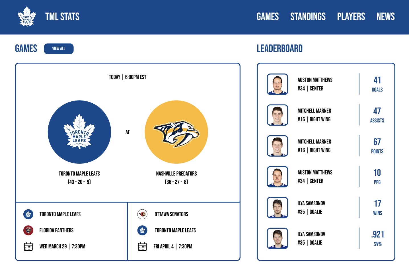
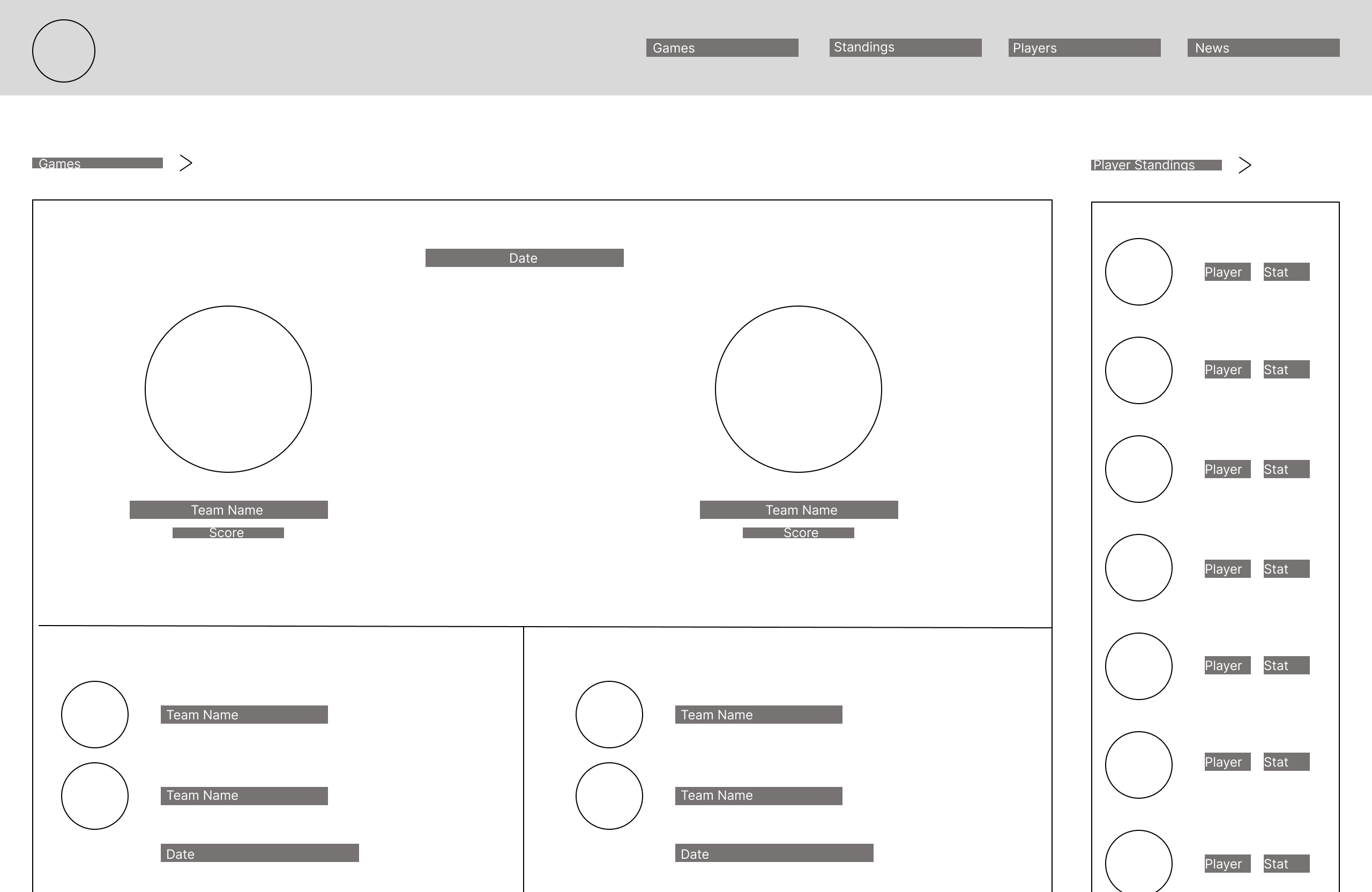
Primary matchup front and centerThe most important piece of information for any fan. Made visually dominant so it reads before anything else.
2
Grouped by proximityGames, standings, point leaders, and news each sit in self-contained blocks. Users answered core questions without leaving the home screen.
3
Scan time dropped from 45s to under 5sClear visual hierarchy meant users stopped scanning across sections to answer simple questions.
Wireframe
1
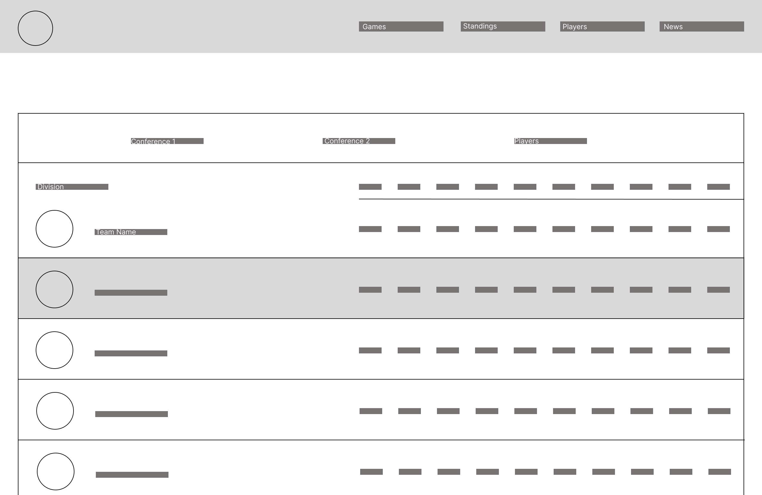
Alternating row backgroundsLong tables are hard to scan. Alternating rows give the eye a track to follow without adding visual noise.
2
Conferences clearly separatedMirrors how fans actually understand the league. No learning required.
3
100% stat recognition at a glanceEvery user correctly identified primary actions and key stats on first glance. Comparison between teams roughly 2x faster.
Wireframe
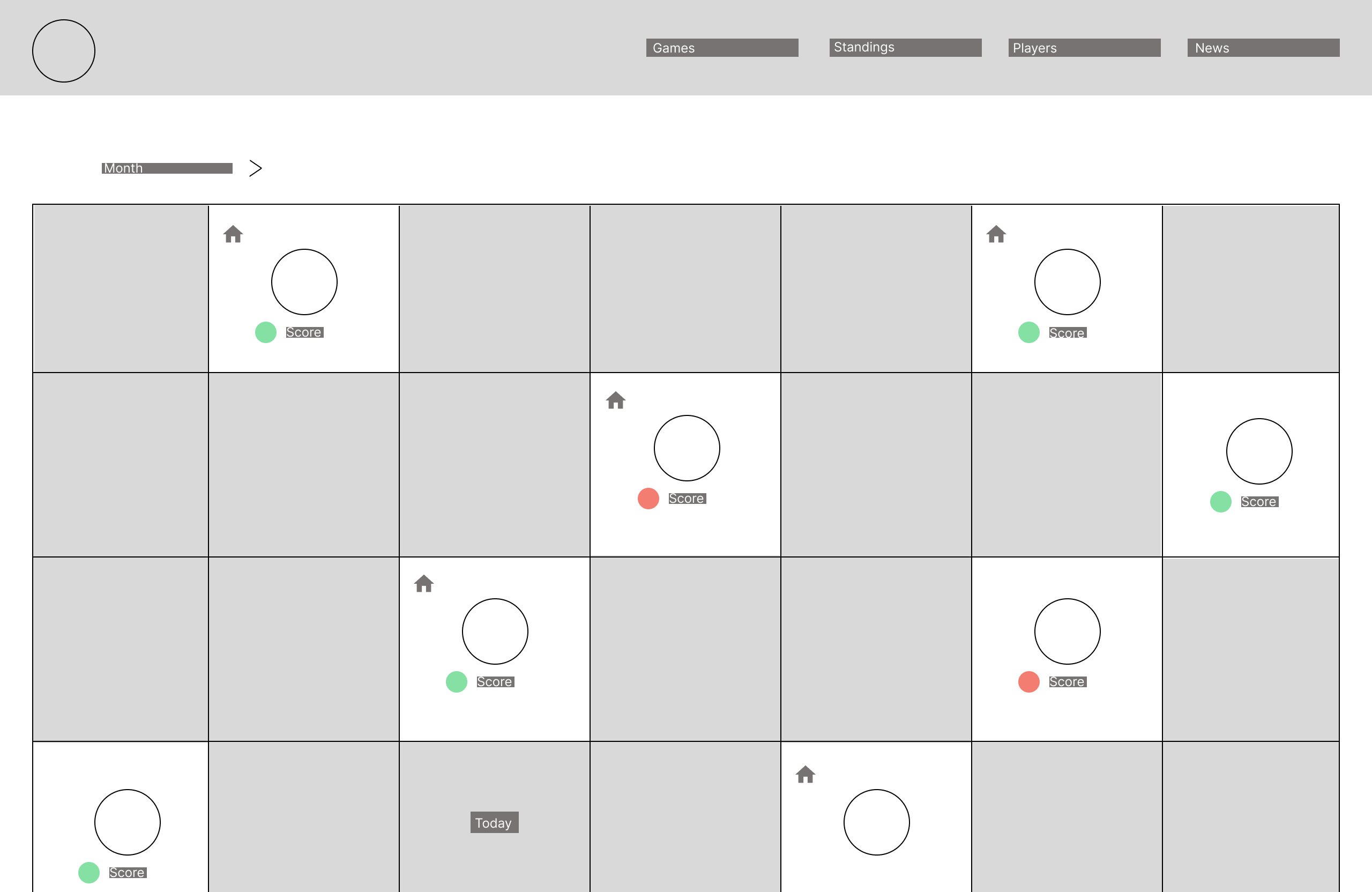
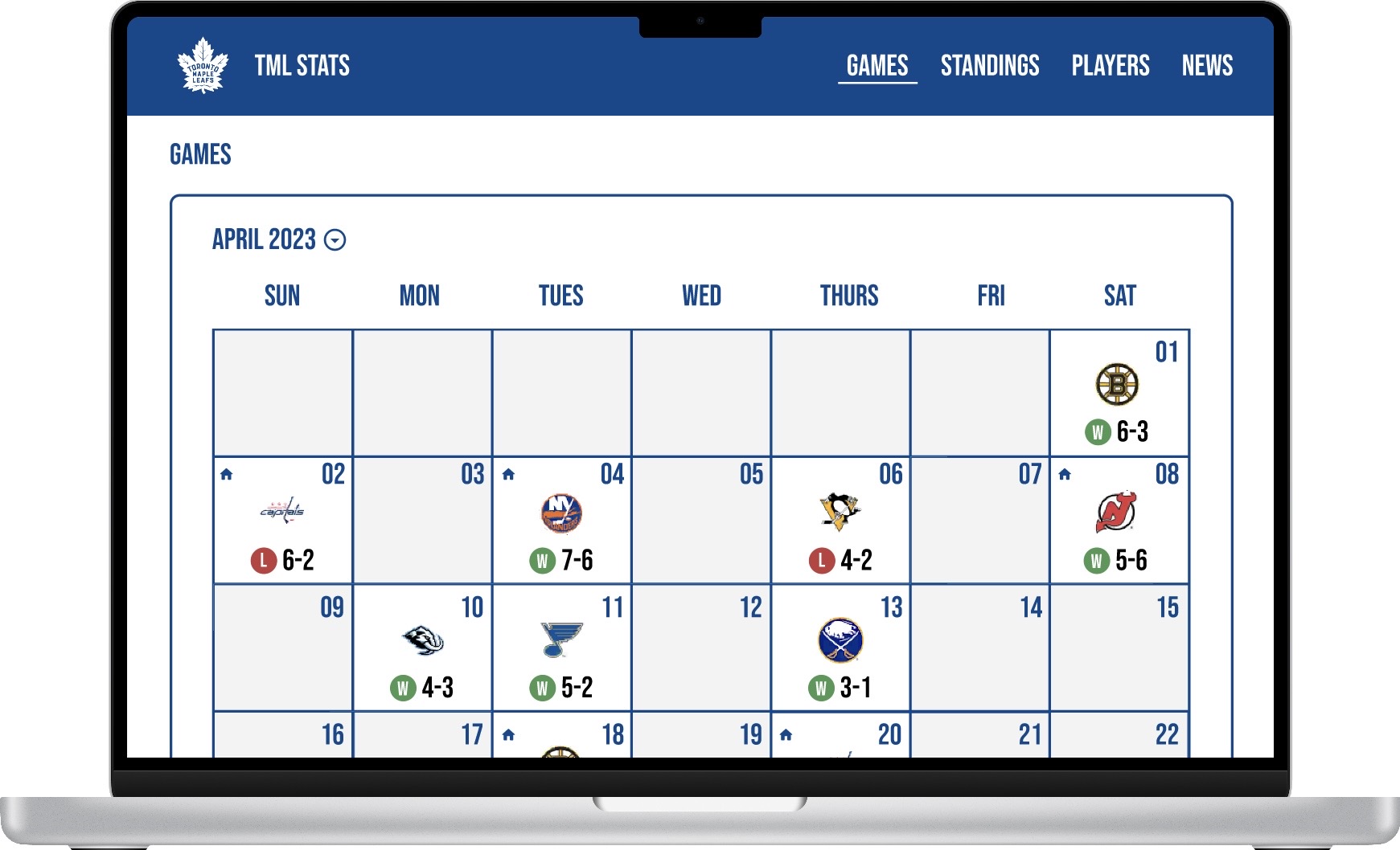
1
Calendar mental modelDesigned to behave like a calendar users already understand. Win/loss status readable without clicking deeper.
2
Color-coded outcomesWin/loss recognizable in under 1 second. 100% of users correctly identified home and away games.
3
Self-explanatory layoutUsers described it as "easy to scan" without prompting. The layout communicates purpose without explanation.
Wireframe
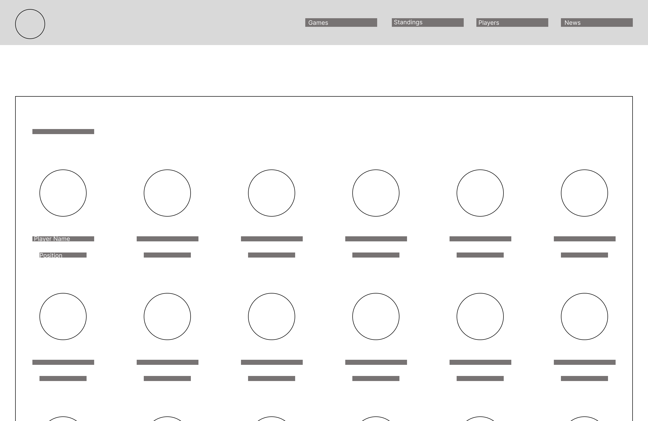
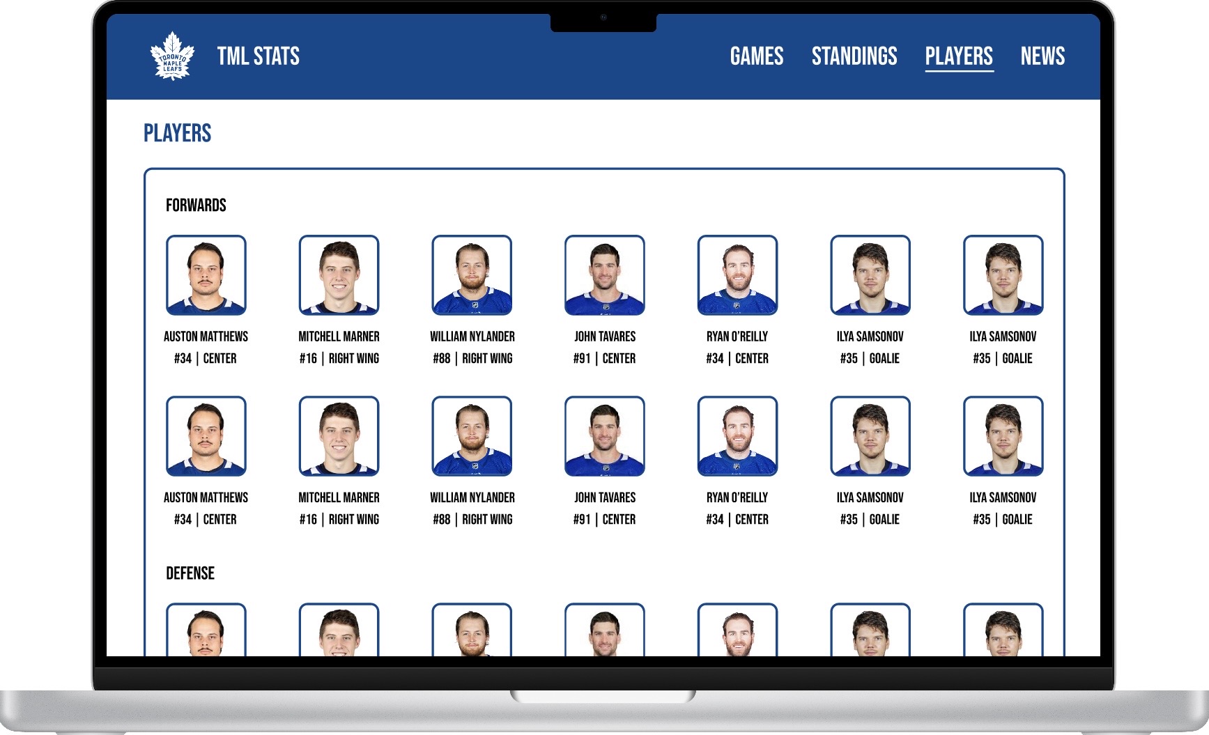
1
Headshots anchor recognitionFaces first, names second. Users recognised players before reading anything, which is exactly how fans already think about their roster.
2
Position and number grouped togetherFast identity confirmation without scanning across separate columns.
3
12/12 users understood immediatelyNo explanation needed. Player identification completed in under 3 seconds. Zero clarification questions asked.
Wireframe
Final Designs
The solution
Four screens designed from scratch to reduce cognitive load across every type of TML fan. Each screen addresses a distinct user need identified in research.
Home
Primary matchup, standings, and news in one scannable view
Standings
League table with alternating rows and conference separation
Schedule
Calendar-style layout with color-coded win/loss outcomes
Players
Roster layout mirroring familiar sports conventions for fast recognition
Outcomes
What the Testing Showed
Moderated usability sessions with 12 participants across three fan types. Same core tasks each round: find today's game, check standings, identify a player.
Usability45s → 5s
Scan time to answer basic questions about the team
Accuracy100%
Every participant correctly identified key stats on first view.
Speed2x
Faster team comparison vs. existing TML platforms
Reflection
What This Project Taught Me
I came in knowing nothing about hockey and left as a huge Leafs fan. I now own a jersey.
The hardest decision
Making structural decisions about how to organize sports data before fully understanding the sport. The only way through was to let the research lead and stop trying to figure out what made sense to me personally.
What I would do differently
The home screen had a news section with no dedicated tab in the navigation. It created confusion about where information lived. I would flag the navigational consequences of that earlier rather than absorbing the problem into the design.
What carried forward
The design was handed off with full documentation. Development paused after handoff due to the client's availability. But the research and the decisions made from it didn't go anywhere. Starting without domain knowledge and having to earn every insight carried into every project after this. I made a point of grounding design decisions in what users actually said and did in sessions, rather than assumptions about what they needed, to reduce bias from the start.
What this changed
Designing without domain knowledge taught me that the best research doesn't come from already understanding the space. It comes from being genuinely curious about it.
The data was never the problem. Making it feel human was.